Website powered by

Sheepish

In 2005 I decided to leave DW after 11 years! That was a big decision because it was my home for so many wonderful memories. Fine art and other film interests were on the horizon and this little film was one that really captured my heart. Between the insanely funny story and family of artists who came together to start a new studio (short lived sadly) I cannot think of another experience that tops this time in my career for just the fun and bold ideas we were all pushing around everyday. Everyone in animation looks up to Mary Blair and I am no exception. I really tried to channel her sensibilities in my sketches. I was finally able to break out of the serious design styles I had been working within for the past 10 years. Walt Peregoy (75 at the time) met with me right before I started on this film. He gave me the best advice I had every been given- I asked- "I'd like to push further than anything I have done Walt. I'm feeling like there is so much more inside. I want my art to be more stylized, but I come from classic drawing and painting" His response was very direct as was his nature. "You're looking at my art (he was an amazing abstract designer from the classic Disney years -think '101 Dalmations - yes that was his look) and think I am pushing something, but really I have drawn like this since I was 8 years old! If you have something else inside- something much more stylized and different, the only way to figure it out is to have the guts to make a fool of yourself and see what comes out!!" He kind of yelled it at me. This was followed with the golden nugget of advice- "If it's in you it will come out. You either have "it" or you don't. You will know pretty quickly." WOW! I followed this advice and still do to this day! Push yourself with everything you do. Do not settle where you are, and always have the guts to push past what you have done before.
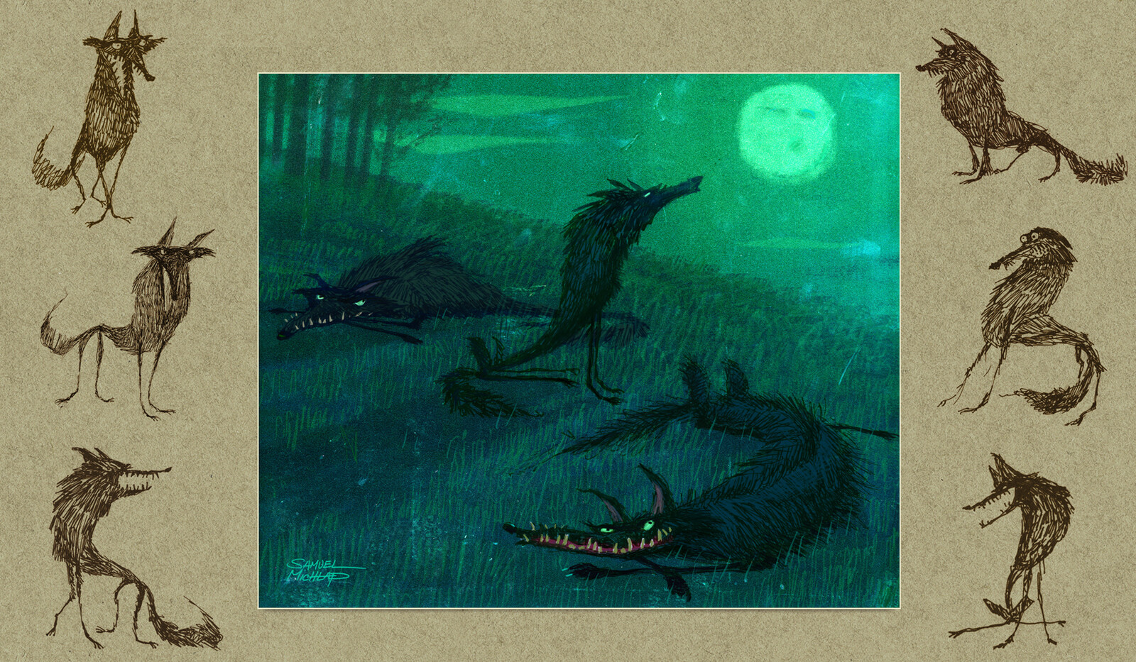
Character design.

Character design.

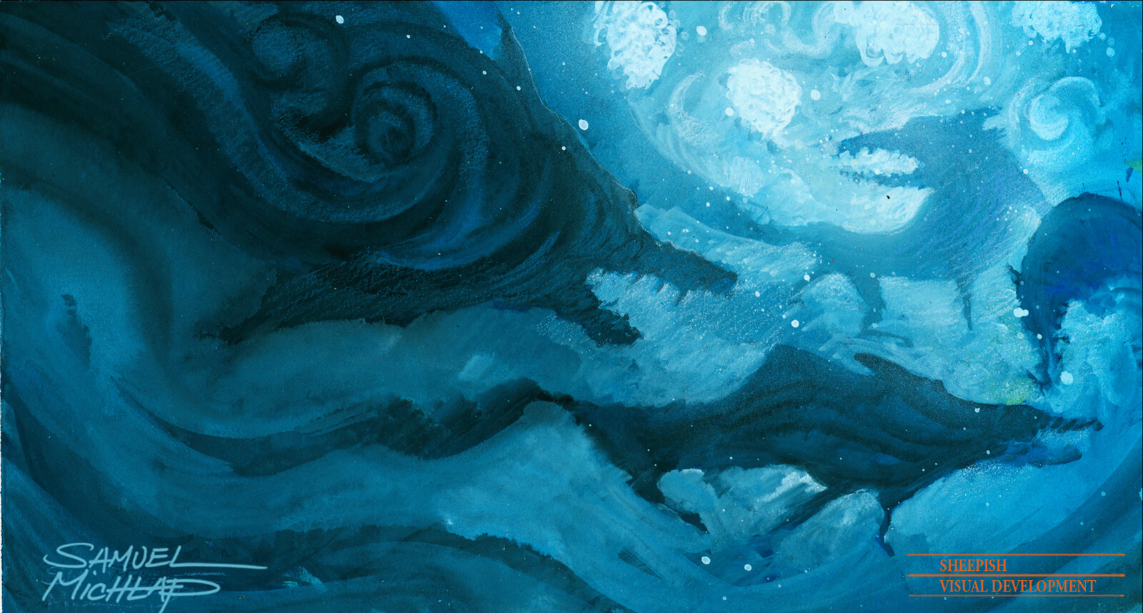
Gouache and pencil for a dream sequence. Trying to be fluid.

Gouache and pencil for a dream sequence. Trying to be fluid.

Early design exploration.

Early design exploration.

Early styling ideas.

Early styling ideas.

Skyler was our hero.  Gouache and pencil.

Skyler was our hero. Gouache and pencil.

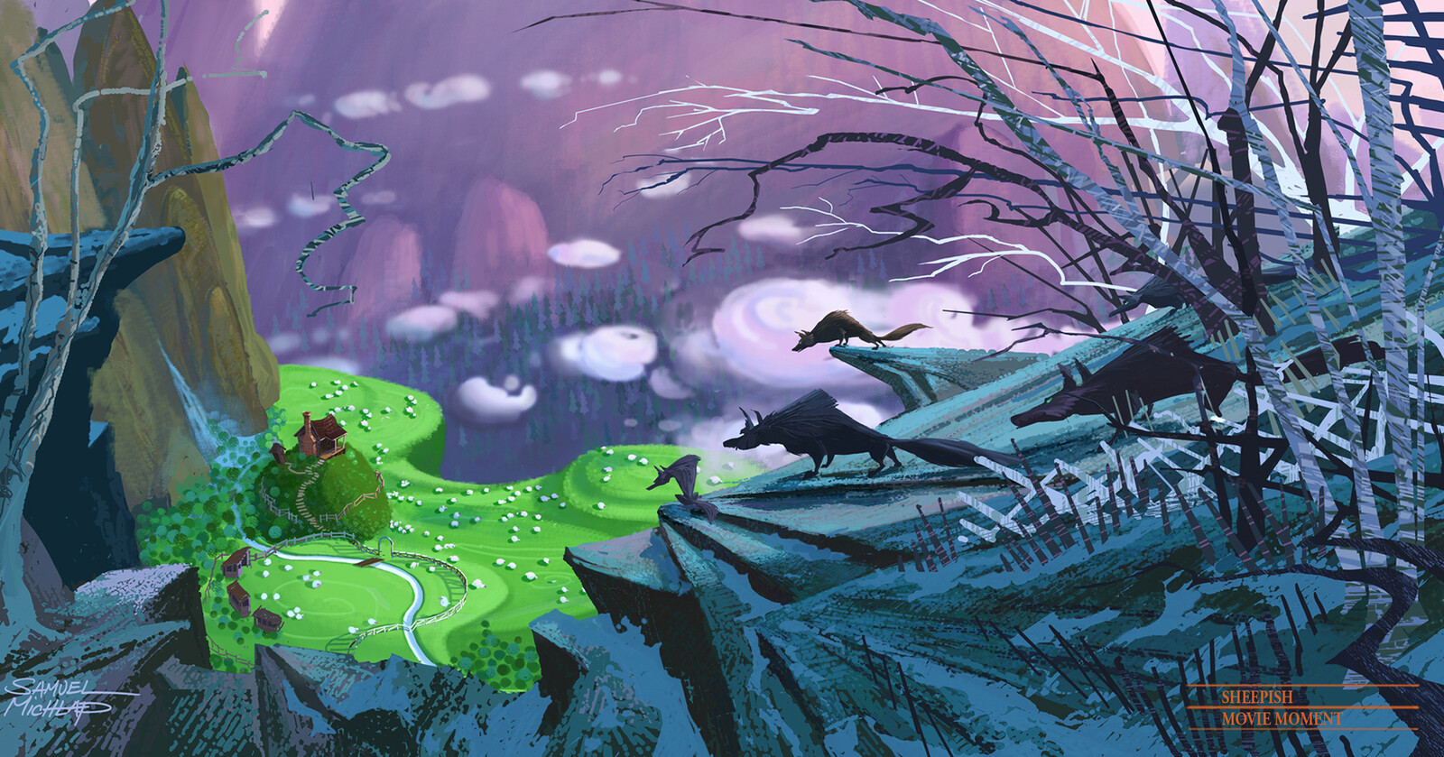
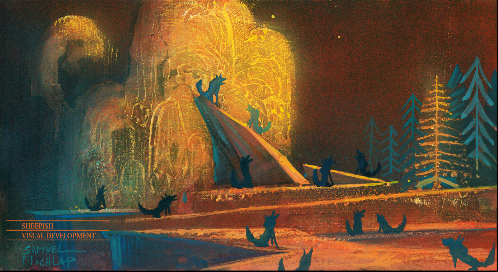
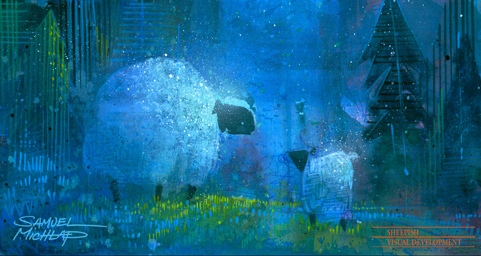
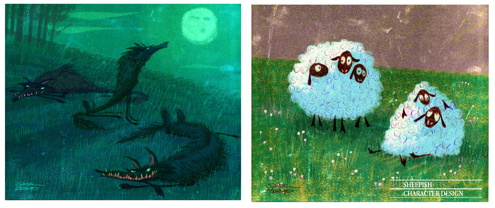
This was as key painting for setting the overall tone. Sheep vs wolves.

This was as key painting for setting the overall tone. Sheep vs wolves.

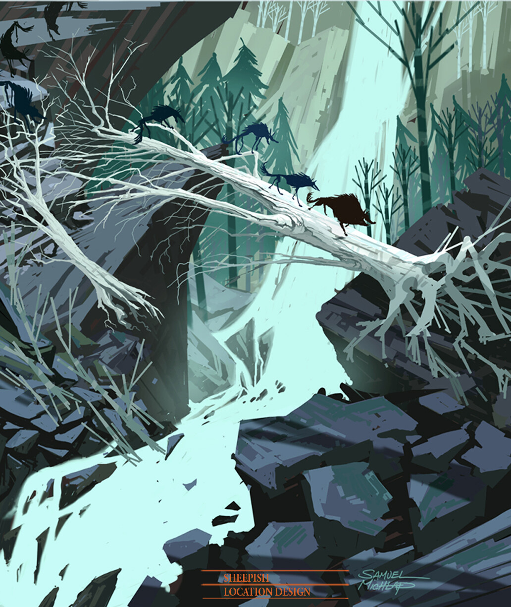
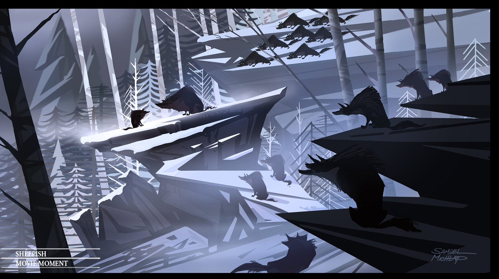
Graphic styling for the mountain world. All sharp and aggressive shapes help define the wolves home.

Graphic styling for the mountain world. All sharp and aggressive shapes help define the wolves home.

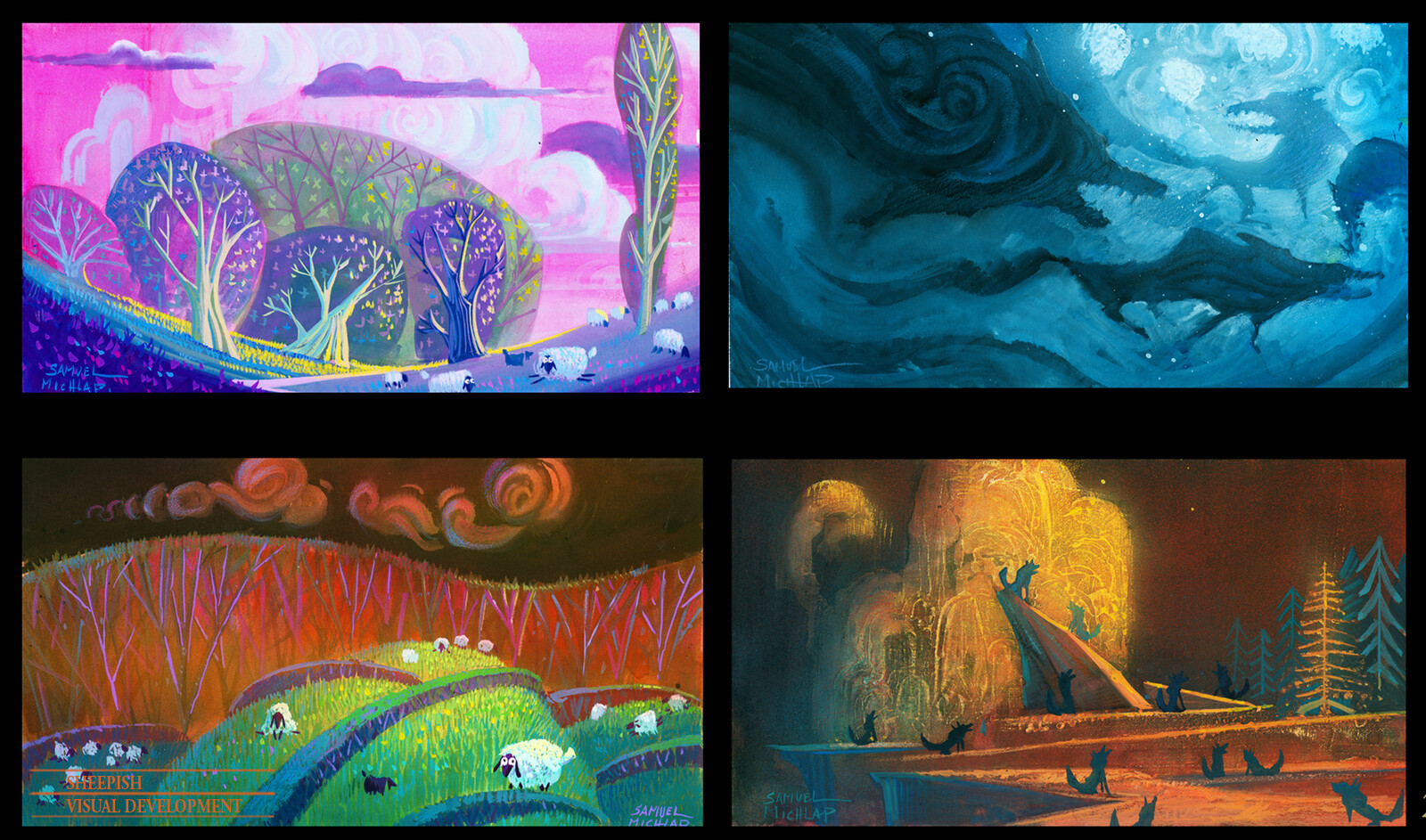
Contact sheet of the first round. I was definitely hanging myself out there. Compare this work with Sinbad to see the progression.

Contact sheet of the first round. I was definitely hanging myself out there. Compare this work with Sinbad to see the progression.

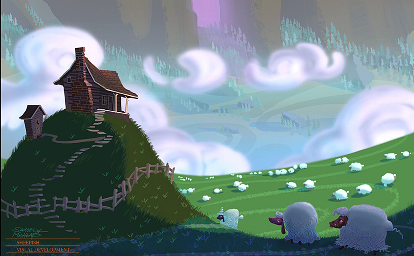
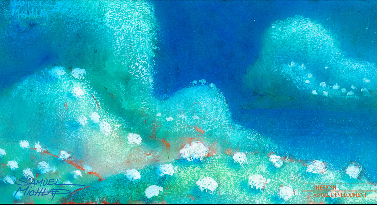
Hills in the shape of fluffy sheep. I was so interested in pushing the shapes and ideas.

Hills in the shape of fluffy sheep. I was so interested in pushing the shapes and ideas.

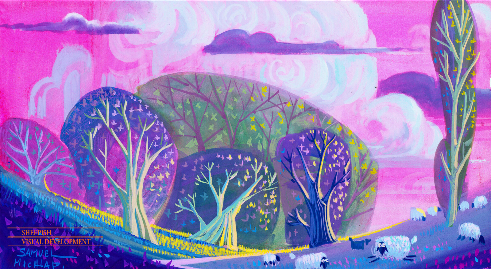
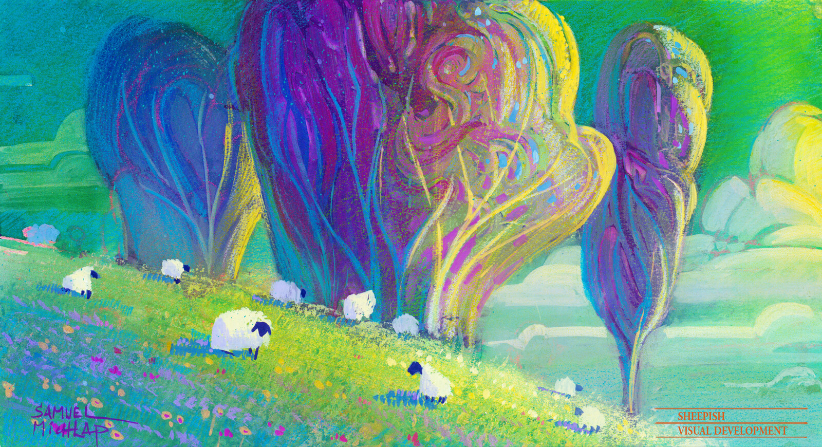
Trees as sheep bodies. Clouds as sheep wool.  So much color and fun!

Trees as sheep bodies. Clouds as sheep wool. So much color and fun!

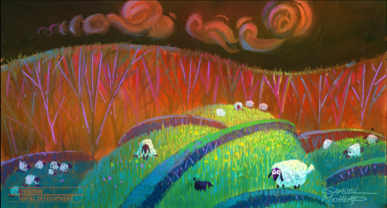
Sheep shapes everywhere was one way to push design. Gouache and color pencil.

Sheep shapes everywhere was one way to push design. Gouache and color pencil.

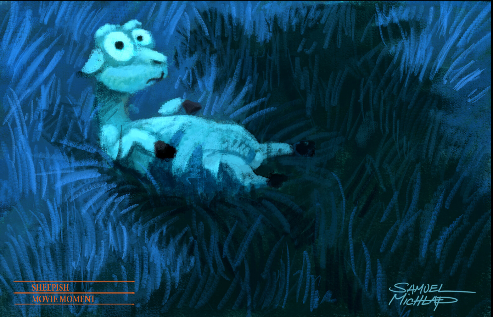
Dreaming sheep. Gouache and color pencil

Dreaming sheep. Gouache and color pencil

Gouache sketch. Simple color approach, but graphic shapes.

Gouache sketch. Simple color approach, but graphic shapes.

Gouache sketch.  Trying to push the shapes and textures.

Gouache sketch. Trying to push the shapes and textures.

Super graphic shapes. Today everyone is doing this, but back in 2005 this was revolutionary for me.

Super graphic shapes. Today everyone is doing this, but back in 2005 this was revolutionary for me.

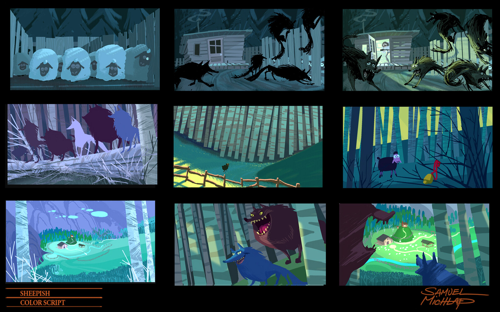
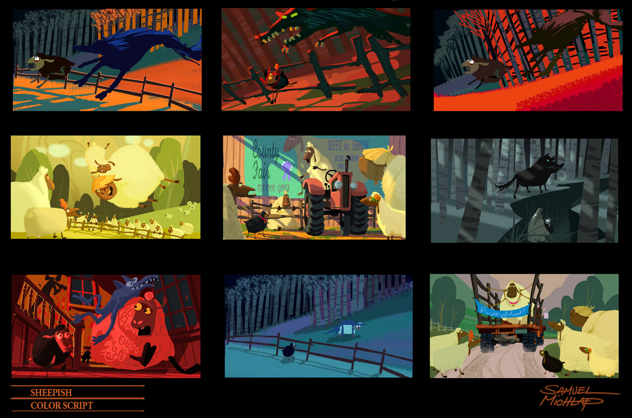
My color scripts became even more simplified due to the abstract approach.

My color scripts became even more simplified due to the abstract approach.

Key frames and color styling.

Key frames and color styling.

Demo painting using Drew Struzan's approach. Gouache and color pencil.

Demo painting using Drew Struzan's approach. Gouache and color pencil.

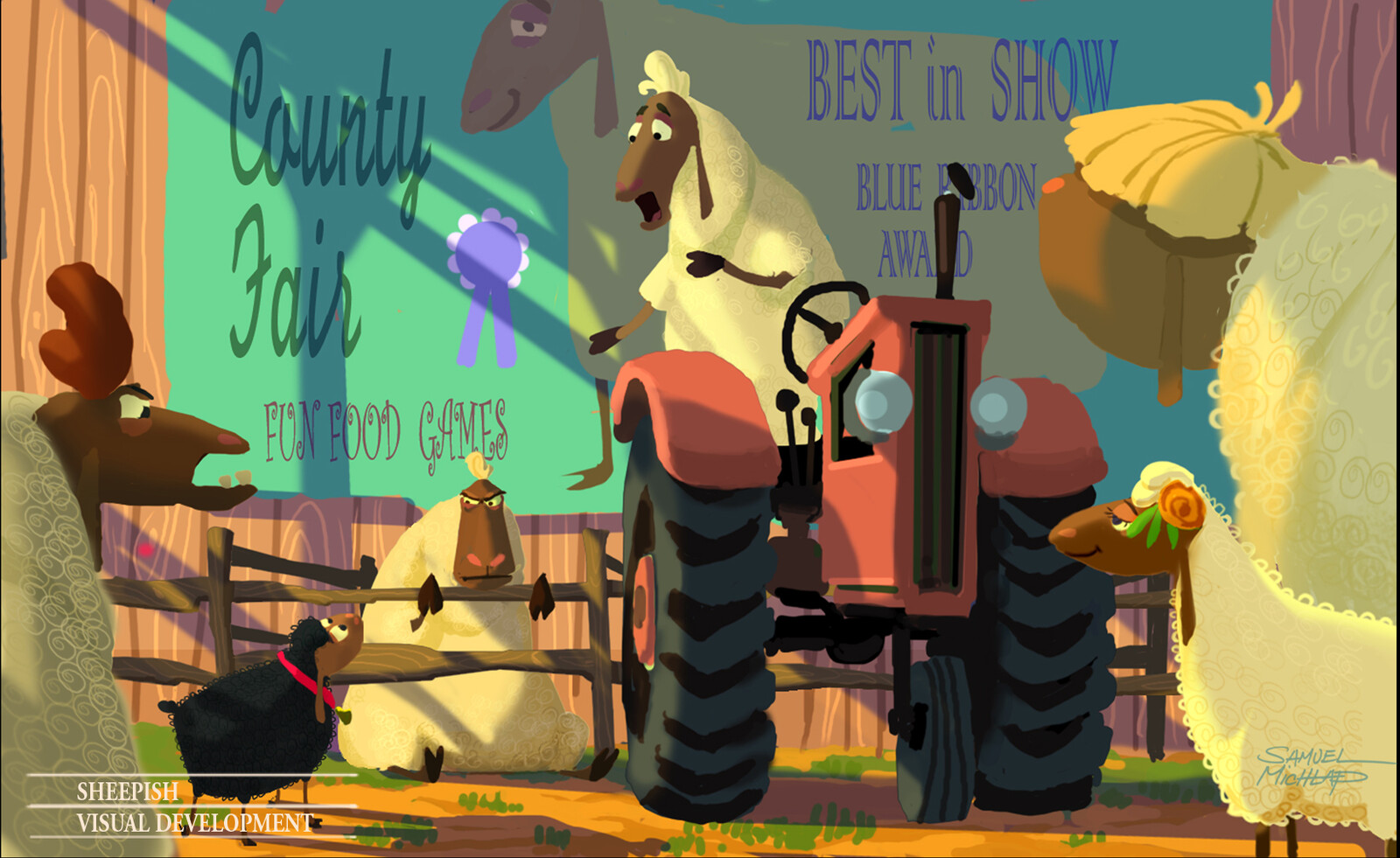
Key frame for overall styling.

Key frame for overall styling.

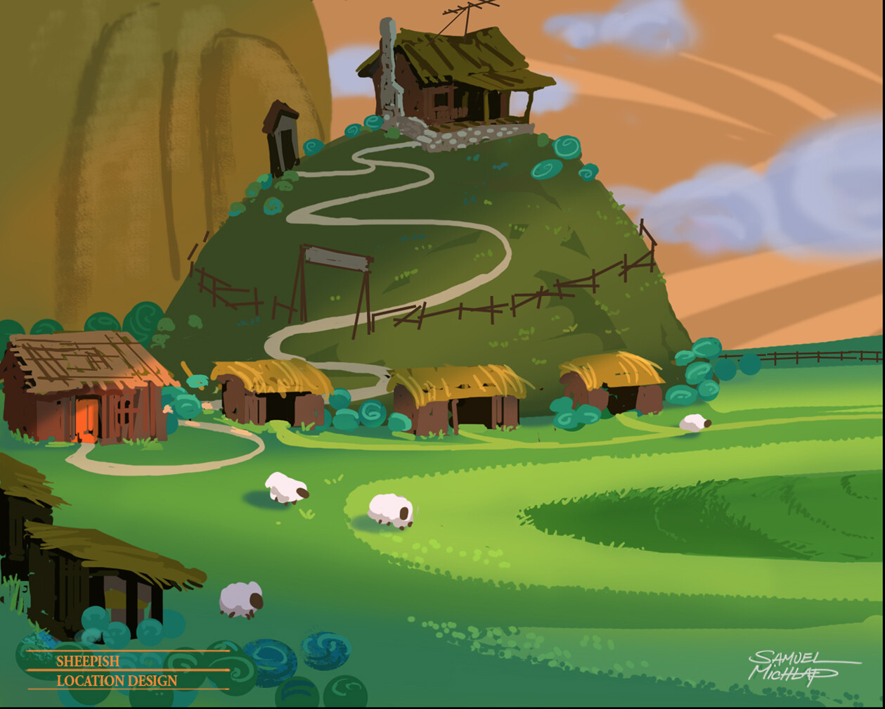
Key frame for location design.

Key frame for location design.

Character design.

Character design.